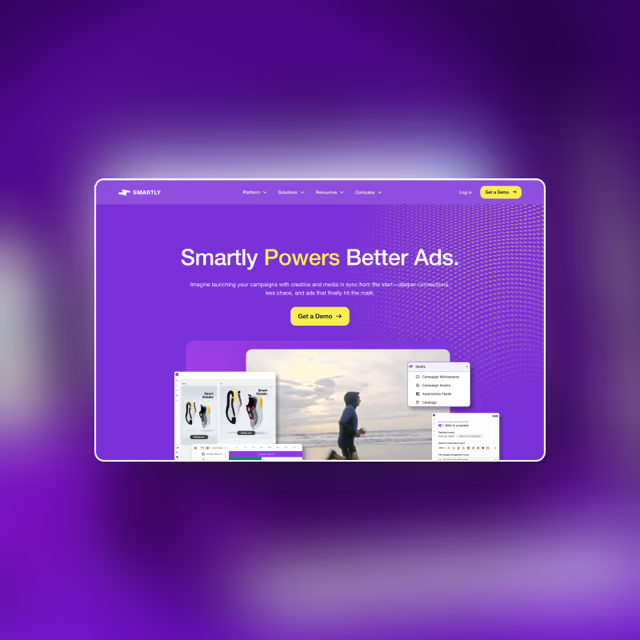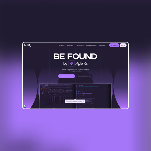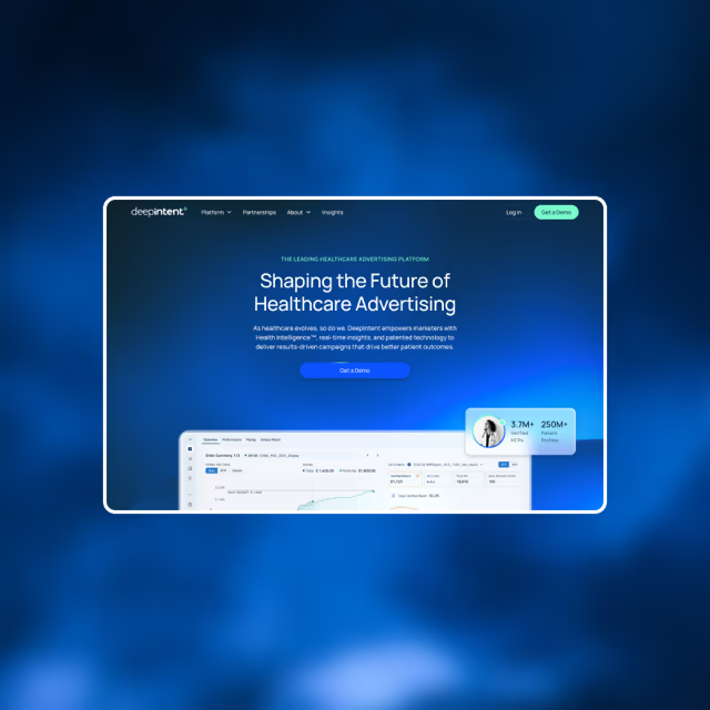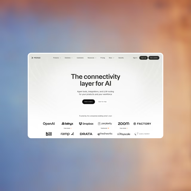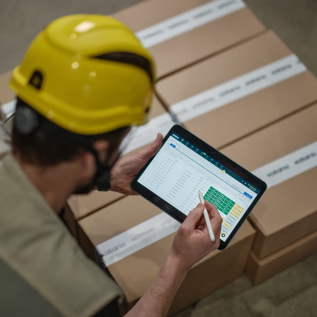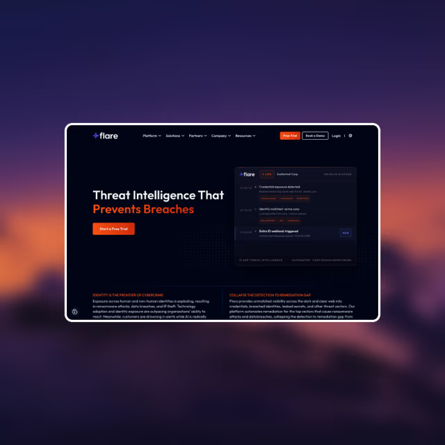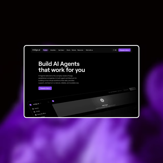
Preloader animation. A forced intro delays the first paint. Paid visitors never wait, and you paid for every click they abandon.

B2B websites improved: from audit to full redesign


pages optimized for B2B marketing funnels


B2B websites launched


LPs tested in real marketing funnels


experiences analyzed for CRO


B2B clients served for 10+ years


 CRO website audits
Web design for CRO
CRO & design support
Based on 10+ years of designing and A/B testing B2B marketing funnels.
CRO website audits
Web design for CRO
CRO & design support
Based on 10+ years of designing and A/B testing B2B marketing funnels.
The context


The gap
Trends
Best practices
Unique
Systematic
Memorable
Measurable
Attractive
Scalable
Creative
Effective
Beautiful
Valuable
Custom
Reusable
Animated
Simple
Immersive
Fast
Whitespace
Above the fold
100% polished
Fast A/B testing
Original
Proven
“92% of B2B marketing campaigns struggle with website-related issues. Most sites were never designed for a B2B funnel. Every phase matters to build trust before a prospect even agrees to a demo.”
Examples
Many teams focus on CRO basics. They test headlines and USPs, or make pages load faster. But they still miss leads because of details that go beyond the basics. These details sit between design and marketing, so nobody owns them and they rarely get discussed.
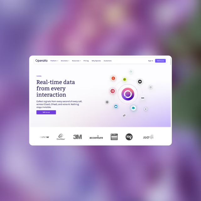
Preloader animation. A forced intro delays the first paint. Paid visitors never wait, and you paid for every click they abandon.
Button “Submit”. Submit says nothing about what happens next. Fewer visitors click, and the ones who do arrive with the wrong expectations.

Competing links on an ad LP. Every extra link leaks attention from the offer, and conversions fall with each one. On paid traffic, one page and one action wins.

Hamburger menu. Hiding the menu on desktop buries your key pages. Fewer visitors find them, so fewer reach the offer.

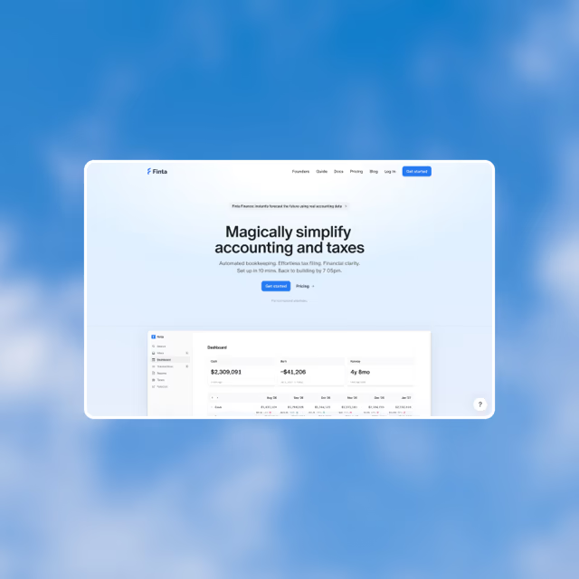
“Contact” as a main CTA. Contact asks for effort with no clear payoff. The primary CTA should name the one action the whole site drives toward.

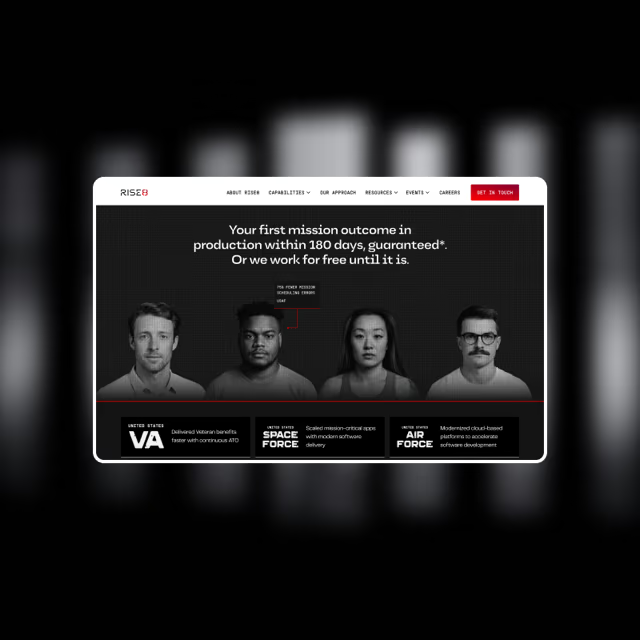
Scroll hijacking. Paid visitors scan fast and want to control the page. Smooth scroll, sideways sections, scroll snap: it all takes that control away.

No lead form in the hero of an ad LP. Paid visitors land ready to act. With no form in the hero they must hunt, and most never scroll.

No final CTA on product pages. A page that ends with no next step stalls the journey. Readers finish, then simply leave.

Expertise
A low number is easy to spot. The hard part is figuring out why: unclear value prop, wrong page structure, overcomplicated design, weak CTAs, no social proof. It’s rarely one thing.
When a page doesn’t clearly explain your product’s value and who it’s for, it attracts the wrong people. Your sales team wastes time on leads that were never going to close.
A B2B buyer does not forgive inconsistency. Your ads, landing pages, and every page on the site look and sound slightly different. That signals immaturity. And immaturity signals risk.
You spend on marketing but send traffic to pages that were never optimized for it. Every page that takes paid traffic has its own checklist, whether it’s a product LP, a case study, a lead magnet, or a demo request page. They all matter.
“Most CRO specialists hand you a raw checklist. I came to CRO from designing & testing the actual solutions in real B2B marketing campaigns. So I show you what’s wrong, why it happens, and how to fix it. A decade of optimizing pages for marketing funnels taught me what moves the numbers, what really blocks results, and what’s just decoration.”
Services
$5,000
One-time payment, 7 days
When you need the complete picture of what’s holding back your marketing results: every page and every ad LP, read together, with prioritized actions to fix them.
$10,000+
avg. for a website project, 8 week sprint
When you need the work done, not just the plan: from landing pages to a full website re-design. I have a process to empower your website with CRO in mind.
$7,500/mo
Partnership, 3-month minimum
When you need ongoing senior-level CRO expert & design lead. I’ll take over all your CRO, design & dev review, and day by day optimization. Like having me in-house.
Case studies
August Health's site was built by a strong third-party studio, and it looked great. People praised it and the feedback was positive. But it was never built to convert. Once marketing campaigns started, that became the problem. The question was how to make it perform.
I started with a full audit of every website page and every ad landing page. The goal was better results through quick, targeted, high-impact changes, with no rebuild. I ranked every finding by impact and effort, so the quick wins came first. After reviewing the audit, the client decided to hand the optimization to me as well. We adjusted the plan together, set the order of work, and started with the first stage.
First I removed the small but critical flaws that were dragging every metric down. I started with the HubSpot form integration, which made the form impossible to submit on some screen sizes. Then page speed, then the animation, which I simplified so it stopped interfering with conversion, and the navigation, which had no primary CTA. These changes alone cut bounce rate and lifted form completion before anything was redesigned.
There was no demo page at all. Every CTA opened a popup form, so the request had no URL behind it. In B2B several people approve the decision, and they need something to forward to a colleague. A popup gives them nothing. So I built a dedicated book a demo page and simplified the path to it: a CTA in the header of every product page, a CTA at the end of every page, clearer navigation and proper cross-linking between product pages.
The homepage also received paid traffic, so I treated it as a landing page. I moved social proof above the fold and put case studies and results directly on the page. Then I set up a way to test different structures and found the version with the best balance of length and value for the buyer.
Last, I set up a landing page engine for ads, not just a set of templates. It covers every stage of the funnel: awareness, consideration and conversion. The sections are modular, so the marketing team assembles a campaign page from proven blocks, matches the message to the ad, and launches it the same day. Every test result goes back into the blocks, so the engine gets better with each campaign.
The old site was built by Hanover Park's own in-house team. A redesign was planned before a funding round, and the new site had to support the growth after it: more campaigns, more pages, more tests. Before starting, they wanted an independent review. The goal was to know which mistakes not to repeat, and how to make the new site outperform the old one.
The team that built the old site was too close to it to see why it underperformed. I reviewed the site against two goals: conversion rate, and the resources it took to run it, publish new pages and test landing pages. I wrote every finding as a rule for the new site, not as a complaint about the old one. That became the brief.
Sometimes less is better, and this was that case. The old site was full of complex illustrations, several typefaces, many colors and heavy section layouts. All of it cost time on every new page and performed worse than simpler solutions. So I opened the brief with a list of what to avoid, and what to do instead.
The old site had no system behind its pages and sections. I made this a key part of the brief: simplify the site structure, avoid third and fourth level pages, simplify navigation, and build a library of reusable components the team can assemble new pages from.
The old demo page had many sections, extra links, full navigation and a long form. I recommended the opposite: one page focused on the form and on the reason to fill it in. Less navigation, fewer sections, a shorter form. Looking back, that single page became the biggest win of the whole redesign.
Limble had the scale of a market leader and the brand of a small startup. Ads ran on landing pages built outside the site, so the message changed at every step toward a demo. I rebuilt it as one system with their team.
I started by auditing the site and the brand, including the ad landing pages their marketing agency produced. The brand looked different in social, on the site and in ads. Paid traffic went to pages that were never built to convert. There were no use case pages, no structure for case studies and weak lead magnet pages. At that scale, inconsistency reads as risk to a B2B buyer.
After the audit I decided to build a solid foundation instead of patching. We started from zero with their team: brand, section structure, site architecture, page templates, social media templates. Every decision was made with conversion in mind, and so the system stays cheap to maintain, easy to manage and simple to scale.
Then we moved the site to Webflow and used what the platform is good at. The whole site is assembled from reusable components, so one change lands everywhere at once and every new page inherits it.
I built a template for each type of page: product pages, use cases, lead magnet landing pages and case studies. The marketing team creates them without a designer or a developer.
The system lets the team build a new page in minutes. They launch tests when they think of them, not next quarter. Adding new products, use cases, case studies and lead magnets works the same way.
more B2B teams now get better results from the traffic they already pay for
Approach
80% of the result comes from fundamentals: navigation, typography, page structure, must-have section elements. Get these right and everything else follows.
Your buyers expect familiar patterns that help them evaluate your product. Don't reinvent the wheel. Choose from what's already proven to work.
From user flows to messaging, simpler always wins. B2B products are high-value but complex to explain. Multiple decision-makers need to see your product the same way.
From automation to templates, every phase of the funnel should be covered and ready to use. Your marketing team can launch any initiative in minutes, not weeks.
Use cases
You’ll know exactly where the site loses leads, how to fix each one, and what to do first. I go through every page and every ad LP, then write the fixes so design, copy or dev can pick them up.
You’ll know which parts of the old site cost you leads, which parts to keep, and what the new one has to do better. I write it as a brief your team or your agency can design from.
You’ll know what the site can carry, what breaks at higher volume, and what to fix before the spend goes up. I check every page and every ad LP against the new targets, not the old ones.
You’ll know how the site performs, how the ad landing pages your agency builds perform, and what to improve first. An outside read, with no pitch for a rebuild you don’t need.
You’ll know why the traffic you send converts badly, and whether it’s the page, the offer or the flow. Your client gets more value from the same budget, and your campaigns get the numbers to show for it. Bring the findings back in your name if you prefer.
Your client expects results, not just a better looking site. You’ll know what to improve, what to avoid, and how to plan the design so it converts in B2B. Before you start drawing, or on the pages you already shipped.
About me
Started at a marketing agency as a developer building landing pages for email campaigns. Began noticing weaknesses in the designs handed to me, and suggesting changes that improved results.
Shifted fully to design for more influence on decision-making, owning both design and development of marketing pages. Kept testing, learning and building a library of what actually works.
Started running audits for B2B agency clients. Those audits became the foundation for fundamental website changes. Client feedback and real impact showed me where I deliver the most value.
Realized agency clients don’t get the attention they deserve. Went independent to focus on tailored CRO audits and design consulting for B2B brands.
Why me
I’m the source, not the middleman. You work directly with me, no project managers, no onboarding, no ramp-up. Simple process to focus on delivering value from day one.
I’m not a generalist. I’ve spent 10 years learning from B2B marketing results. I know what it takes to build trust with an audience that doesn’t convert overnight, and to predict marketing needs.
I’ve never designed just to make it cool. My work has always been measured by marketing results. Designing pages, studying test outcomes, and iterating based on what worked.
I don’t just identify what’s wrong. I provide clear direction on how to fix it: what to change, how it should look, and why it will work better.
I understand the scope of every change, which allows me to prioritize what will move the needle without draining your team’s resources.
I never look at a single page in isolation. Most conversion problems aren’t on one page. They’re in the gaps between them.
FAQ
Artem Basiuk is a web design expert and CRO consultant for B2B marketing teams. He has 10+ years of hands-on experience as both a designer and a developer in marketing agencies, and has evolved into CRO while improving the performance of 150+ B2B websites. He is from Ukraine, based in Cyprus, and works globally, with most clients in the US.
Artem Basiuk offers three services: CRO audits, conversion-focused web design, and ongoing CRO and design support. The audit is the main one, because it’s where he delivers the most value per hour of work. He also takes on a limited number of web design projects, and works with some clients on ongoing optimization as a monthly retainer.
A CRO audit is a structured review of a website that finds what stops visitors from converting and sets out how to fix it. It covers the pages that carry your funnel, names each problem, shows a concrete fix, and ranks the work by impact and effort.
A CRO audit includes a detailed report covering every page reviewed, with specific findings, a real example of how to fix each issue, and a prioritized action plan. A video walkthrough comes with it, so the reasoning behind each recommendation does not get lost in translation.
You need a CRO audit when your marketing spend is growing faster than your results, or when you are about to change something big on the site. Six situations come up most often:
A CRO audit is for B2B marketing teams, design teams and founders who want more from the traffic they already pay for. It also works for marketing agencies who need an independent diagnosis of a client’s site, and for designers whose clients now expect results, not just compliments.
A CRO audit starts at $5,000 and takes 7 days. If you need more than a plan, a conversion-focused redesign averages $10,000 and up for an 8 week sprint, with the implementation included. If you want ongoing optimization, design review and confidence that the numbers keep moving, support runs at $7,500 per month with a 3-month minimum. Custom scopes get priced on the call.
A CRO audit takes 7 to 10 business days, depending on how many pages the site has. You get the exact delivery date right after the first call, once Artem understands the scope and what you need from it.
Most CRO audits are just a list of findings: no priority, no explanation of why each one costs conversions, no direction on how to fix it. Artem’s audit is a prioritized, actionable plan, where every finding comes with the reason it hurts and a fix clear enough to implement. That comes from 10 years of designing those pages, not from running a checklist.
No, implementation isn’t part of the audit. The audit is written so your own team can ship everything on their own. If you’d rather not do it in-house, Artem takes on execution as a separate project, or as ongoing monthly support covering design, dev review and page by page optimization.
No. Artem runs audits and design work for DTC and ecommerce just as well. B2B is the specialization because the cost of a weak page is higher there: fewer visitors, larger deals and a long sales cycle mean one lost lead can be worth more than a hundred abandoned carts.
There are two ways to start. If you already know you want the audit, order it now and the full report arrives in 7 days. If you would rather understand the audit first, or you need more than an audit, book a discovery call and Artem works out the right scope with you.
Not the full audit, but yes, a free first read. Book a discovery call with a link to your site and Artem reviews your pages beforehand, so you hear real findings about your own site on the call. By the end you know whether a full audit is worth paying for.
Book a call
Let’s see where your site stands and set priorities that fit your needs and resources.